June 2, 2020
Instagram UX Recommendations (version 144.0)
Goal: In one day, how many UX issues can I find within the Instagram app, and what solutions can I come up with to address those issues?
Direct Message: “This photo is hidden because @xyz has a private account. Follow @xyz to see their photos and videos.”
Most Instagram users have experienced this message in one way or another during their time with the Instagram app. Asking myself “why doesn’t Instagram do more to prevent this problem,” I set out to do a quick UX evaluation and redesign to a few of Instagram’s features.
Identifying Issues
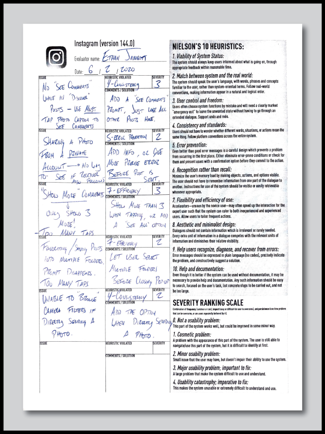
My first step in this process was to go through the Instagram app and identify areas where the user was slowed down while trying to complete a task. I completed a heuristic evaluation for this.
Key areas of improvement:
Sharing a post from a private account.
Viewing a thread of replies to a comment.
Favoriting/saving posts to multiple collections that a user has.
Browsing camera filters when sending a direct photo
Issue #1: Sharing a post from a private account
When sharing a post from a private account, the app prompts that the account is private and the receiver may not be able to view the post if they don’t follow that account. The app still allows the user to send the post to whomever you’d like, but doesn’t inform the user if the person they’re sending it to also follows that account. The only way the user can be sure if the receiver can see the post is if they manually check to see if the receiver follows the account.
Heuristic violated: Error Prevention
Proposed Redesign
Using metadata, the app could show the main user whether or not receiving users follow the same private account. This prevents the user from not knowing whether or not the receiver will be able to see the content that is being shared.
When tapping the “share” button, the user gets the usual prompt that the content is private, and their suggested contacts are shown. The difference in the redesign is that it’s shown which users will be able to see the content with a solid selectable circle, and which users will not be able to see the content with a dashed-circle.
Upon selecting a user that does follow the private account, the usual blue “selected” indicator fills the circle. When selecting a user that doesn’t follow the account, a grey “selected” indicators fills the circle. The user is also prompted in the “send” button that some users may not be able to see the content they’re sending.
Use my Figma prototype to view this redesign in action. Click the "Share” button underneath the post to see the redesigned share prompt.
Issue #2: Viewing reply threads to comments
Relatively recently, Instagram gave users the ability to reply in-line to comments and start a thread of replies to an original comment on a post. The problem with Instagram’s implementation of this feature is that the user is only able to load 3 replies at a time when they tap the “view previous replies” button. If a comment has a substantial number of replies to it and the user wants to view the entire conversation, they need to press this button a ridiculous number of times. Just to view a thread of replies to a comment that has 10 replies, the user needs to tap this button 4 times.
Heuristic violated: Flexibility and Efficiency of Use
Proposed Redesign
The primary goal of my redesign was to reduce the number of times that the user needs to tap in order to see the whole reply thread. I took some inspiration from how Reddit allows users to expand and collapse their reply threads.
Tapping the “Show # replies” button loads all of the comment’s replies. From there, the user can collapse the thread by tapping “Hide comments,” or they can tap the thin line to the left of the indented thread. This is especially useful if the user has begun to scroll down and would like to collapse the thread of replies without scrolling back up.
Use my Figma prototype to view this redesign in action. Click the "View 175 Comments” button underneath the post to see the redesigned comment reply section.
Issue #3: Saving posts to multiple collections
Instagram allows user to create “collections” where they can save posts. Users can either just tap the save ribbon icon to save a post to their general saved folder, or they can press and hold the button to save to a specific collection that they’ve created. For example, when I see photos of cars that I like, I press and hold the button to save the photo to my “cars” album.
The issue presents itself when the user wants to save content to more than one collection. Once a single collection is selected, the prompt disappears, forcing the user to press and hold the save icon again, and then select another collection. The user needs to repeat this process for each collection they want to save a single post to.
Heuristic violated: Flexibility and Efficiency of Use
Proposed Redesign
My redesign proposal is simple – once the prompt comes up to select an album, simply allow the user to select multiple albums before tapping “done,” or tapping outside of the pop-up to close it.
See my Figma prototype to view this redesign in action. Click the save-ribbon icon underneath the post to see the new interaction design for saving to an album.


